 i love love love the work of charles and ray eames. not only did they produce a huge body of beautiful, functional work, their philosophy of design and attention to the the time and context in which they were living has always amazed me. watch for these stamps later this year!
Tuesday, January 29, 2008
"Take your pleasure seriously."
 i love love love the work of charles and ray eames. not only did they produce a huge body of beautiful, functional work, their philosophy of design and attention to the the time and context in which they were living has always amazed me. watch for these stamps later this year!
Sunday, January 27, 2008
show your bones
 via notcot - i'll admit, i'm partial to good swedish design, but i love bjorn johansson's 'anatomy of a typeface,' country of origin notwithstanding.
Saturday, January 26, 2008
bloom where you're planted
Friday, January 25, 2008
the nowhere west
 I'm currently working on the type layout for my fiance's band's forthcoming cd. The beautiful illustrations were done by my friend Ryan - his work is amazing.
Coming from a Swiss-based design education, combining 7 typefaces kind of made me nervous, but I think it worked out ok. Check back for the final incarnation.
new additions
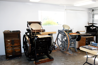
 I am the proud new owner of a Brandtjen & Kluge Letterpress (left) and a Chandler & Price Guillotine (far right). Friends Angela and Raquel were kind enough to let me store them in their studio, along with their C&P (middle). Let the printing begin!
Wednesday, January 23, 2008
Subscribe to:
Posts (Atom)


